Question:
I am considering purchasing the carousel plugin, and I had a question about functionality. This plugin will only work for me if it can be responsive at multiple breakpoints, and I don't see a setting for that.
What I mean is -- I have it set so that the number of visible items is 4. On wide screens it shows all four items, and there's a breakpoint so that narrow screens only show one item. But there is no in-between -- it goes from one to four, which means that at the medium screen widths, the four items are very squished. I would like to add additional breakpoints so it can go from 1 item, to 2 items, to 3 items, to 4.
Please let me know if this is possible.
Answer:
Please goto https://www.wonderplugin.com/wordpress-carousel/ and download the new version 2.1.
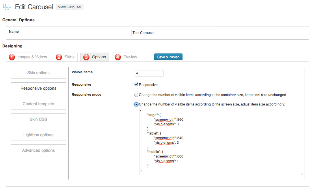
In the new version, step 3, there is a new button "Responsive Options", you can choose the responsive mode "Change the number of visible items according to the container size, keep item size unchanged".
You can also change the number of visible items by using the screen size query.
For example, you can change the default visible items to 4, then use screen query to change it to 3, 2, 1 according to the screen size:
{
  "large": {
    "screenwidth": 960,
    "visibleitems": 3
  },
  "medium": {
    "screenwidth": 800,
    "visibleitems": 2
  },
  "mobile": {
    "screenwidth": 600,
    "visibleitems": 1
  }
}
Please note. The above screen query is a json string, the property name must be wrapped with double quotes.